Description
Squaretype – Modern Blog WordPress Theme
Squaretype. Modern WordPress Theme for Content-Based Blogs & Magazines
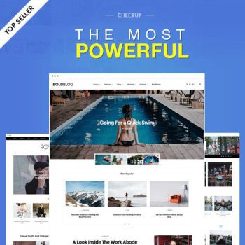
Squaretype is a modern and clean WordPress theme for modern content-based blogs and magazines.
9 Beautifully Designed Demos in One Theme
Thanks to our signature feature, the Demo Switcher, you may apply a new demo any time without affecting your content. If you feel bored with one of the demos, simply apply a new one and get a completely different appearance of your blog or magazine.
Hero Section
Display featured posts in multiple layouts and variations on your homepage. Select a matching background and appropriate sidebar content.
- Numbered or Simple Post List
- Custom HTML Content (Ads or Shortcode)
- Any Widget
- No Sidebar
BACKGROUND OPTIONS:
- Rock-Solid Color
- Beautiful Gradient
- Engaging Post Preview Image
HEADING SIZE
Category Filters
Enable sub-categories filter on category pages for content-heavy websites. It will help your visitors navigate between categories and sub-categories and find the post they’ve been looking for.
There are three different page header types for your posts and pages. Display your featured posts’ header with an image overlay or a smaller page header.
Smart Colors
When you select a dark background color for your header or footer, the text and links color will automatically change to white. You don’t need to set up a lot of color option, as most of them will work automatically based on your selection.
Customize with Instant Live Preview
All theme options can be configured with the native WordPress customize feature. Forget the outdated settings pages and manually refreshing your page to see the changes. Preview all the changes live while configuring your perfect blog or media.
Multiple Archive Layouts for Homepage and Archive Pages
Choose from different post archive layouts for your homepage and archive pages. Display your posts in grid, list, full, timeline or masonry layouts.
Multiple Page Layouts
Select the matching page layout for your homepage, archives, posts, and pages. Display a sidebar on either the left or right side or use the full-width page layout for your content.
Showcase your recent posts with a thumbnail right in the menu dropdown. Don’t worry, the menu will not slow down your website, as the content is requested dynamically, only when a user hovers over the parent menu item.
AMP Support
We have added styles for the AMP pages to match the main styles of your website. Simply activate the official WordPress AMP plugin to enable Google Accelerated Mobile Pages on your website.
Exclude Featured Posts from the Main Archive
Everybody knows, and Google, in particular, that duplicate content is bad. Avoid having duplicate content on your homepage by excluding featured posts from the main archive with a single click.
Google Fonts
Create different styles with 800+ Google Fonts supported. Simply select the desired font from the dropdown and preview it instantly on your website – no more confusing CSS rules or code snippets.
Additional Content
Ever wanted to place an ad spot underneath your header? Or a short description before the featured posts section on your homepage? A subscribe form below post content? With our signature feature you may insert any content into different template parts without changing template files or overriding templates with a child theme.
Smart Sticky Navigation
Increase mobile users’ viewport by displaying the main navigation only when they scroll up. Or force the menu to stay sticky all the time. Or disable the feature completely, it’s up to you! Enable either of the three options in theme settings with a single click.
Make your widgets sticky when scrolling the page. Select from two options: either stick to the bottom edge of your sidebar or the top edge of the last widget. Increase your ad’s conversion by setting the ad as your last widget and selecting the latter option. Unlike other theme’s sticky sidebars, ours is enabled and doesn’t flicker on tablets or mobiles. By using the native browser’s sticky positioning, we created a sticky sidebar that animates gorgeously not only on desktops but mobiles too.
It’s you who decides how to structure your content. Our theme supports unlimited levels in your main menu. If there’s not enough space in the viewport to display a dropdown submenu, it will appear on the opposite side instead. And it supports mobile touch devices, too.
Display the mobile menu upon clicking the hamburger icon on mobile devices. You may also place social links, subscription form, Facebook fan page or any other widget on your mobile menu, just as in a regular sidebar.
Smart Featured Post Sources
The featured post section can have different post sources. You may filter posts by tag or category and order posts by date, post views or even specify the timeframe when the posts were published.
Paginated Posts
Divide your posts into multiple pages and add properly styled pagination at the bottom of your posts.
